Theming
Switch between dark and light mode
Overview
OnSphere currently supports two display mode :
dark-mode
light-mode
Note
The display mode is saved in the user preference.
Usage
You can specify which theme mode to use for front-end:
light: Uses light theme
dark: Uses dark theme (default)
You can also specify if the user can change the theme manually by using the icon in the dashboard header which is enabled by default. To disable this functionality, set modeIsLocked to true in stack.cfg file :
{
    "theme": {
        "mode": "dark",
        "modeIsLocked": false
    }
}
Customize logo
Inside the stack.cfg, you can configure the front-end log and name to match your own visual identity. You need to define a new resource in both web and keycloak modules.
{
    "resources":
    [
        {
            "source": "theme/images", //File or folder path in the configuration (relative path)
            "destination": "images" //File or folder path on the running module (relative path)
        }
    ]
}
In the stack.cfg file, you can specify following properties:
name: Name of the stack, displayed on the front-end
theme.logoWithoutText: The logo to display on the login page, account page and dashboard. If it is not defined, the logo with text will be used or the default one. The file must be added in Keycloak and web modules resources.
theme.favicon: The favicon image. The file must be added in Keycloak and web modules resources.
{
    "name": "OnSphere",
    "theme": {
        "logoWithoutText": "images/logo.png",
        "favicon": "images/favicon.png"
    }
}
Theme overriding
Warning

Features currently under evaluation may be modified in the next version without prior notice. If you are using these beta features, we welcome your feedback and experience. Your input is crucial to refining and improving these features before their official release. Please share your thoughts and experiences with us, and contribute to the evaluation process.
We support experimental theme overriding. This feature has no dispatcher validation and should be use with good understanding of underlying Material UI customization (see default theme viewer for all overridable parameters).
To extend current OnSphere theme, you can provide in the following content in stack.cfg file:
{
    "experimentalThemeOverride": {
        "all": {},
        "dark": {},
        "light": {}
    }
}
With the following example configuration, you will be able to achieve light and dark theme override:
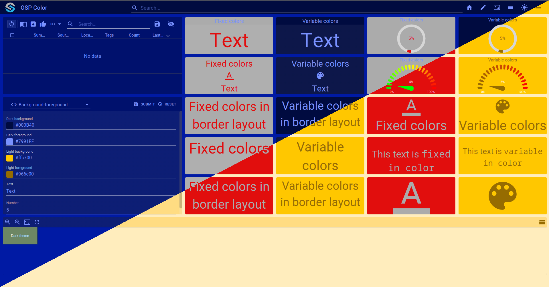
Note
The complete can be checked out with git checkout origin/example-dashboard-experimental-theme-override .
{
    "moduleId": [
        "modules.keycloak.keycloak-1",
        "modules.web.web-1",
        "modules.configuration-dispatcher.main"
    ],
    "theme": {
        "mode": "dark",
        "modeIsLocked": false,
        "logoWithoutText": "",
        "logoWithText": "",
        "background": "",
        "favicon": "",
        "experimentalThemeOverride": {
            "all": {},
            "dark": {
                "palette": {
                    "background": {
                        "default": "#001aa4",
                        "paper": "#00116d"
                    },
                    "primary": {"main": "#7991FF"},
                    "secondary": {"main": "#002EFF"},
                    "text": {
                        "primary": "#7991FF"
                    }
                },
                "components": {
                    "MuiAppBar": {
                        "styleOverrides": {
                            "root": {
                                "backgroundColor": "#000B40",
                                "color": "#7991FF"
                            }
                        }
                    },
                    "MuiButton": {
                        "styleOverrides": {
                            "root": {
                                "color": "#7991FF"
                            }
                        }
                    },
                    "MuiSvgIcon": {
                        "styleOverrides": {
                            "root": {
                                "color": "#7991FF"
                            }
                        }
                    },
                    "MuiIcon": {
                        "styleOverrides": {
                            "root": {
                                "color": "#7991FF"
                            }
                        }
                    }
                }
            },
            "light": {
                "palette": {
                    "background": {
                        "default": "#ffedbe",
                        "paper": "#ffdc82"
                    },
                    "primary": {"main": "#966c00"},
                    "secondary": {"main": "#ffcc4a"},
                    "text": {
                        "primary": "#966c00"
                    }
                },
                "components": {
                    "MuiAppBar": {
                        "styleOverrides": {
                            "root": {
                                "backgroundColor": "#ffc700",
                                "color": "#966c00"
                            }
                        }
                    },
                    "MuiButton": {
                        "styleOverrides": {
                            "root": {
                                "color": "#966c00"
                            }
                        }
                    },
                    "MuiIcon": {
                        "styleOverrides": {
                            "root": {
                                "color": "#966c00"
                            }
                        }
                    },
                    "MuiSvgIcon": {
                        "styleOverrides": {
                            "root": {
                                "color": "#966c00"
                            }
                        }
                    }
                }
            }
        }
    }
}