Chart
Overview
Chart widgets allow to display analytic query results.
Interactions
Limit the data set see limit widget page for references
Chart dispositions
Chart widgets can dispose the values in two different ways:
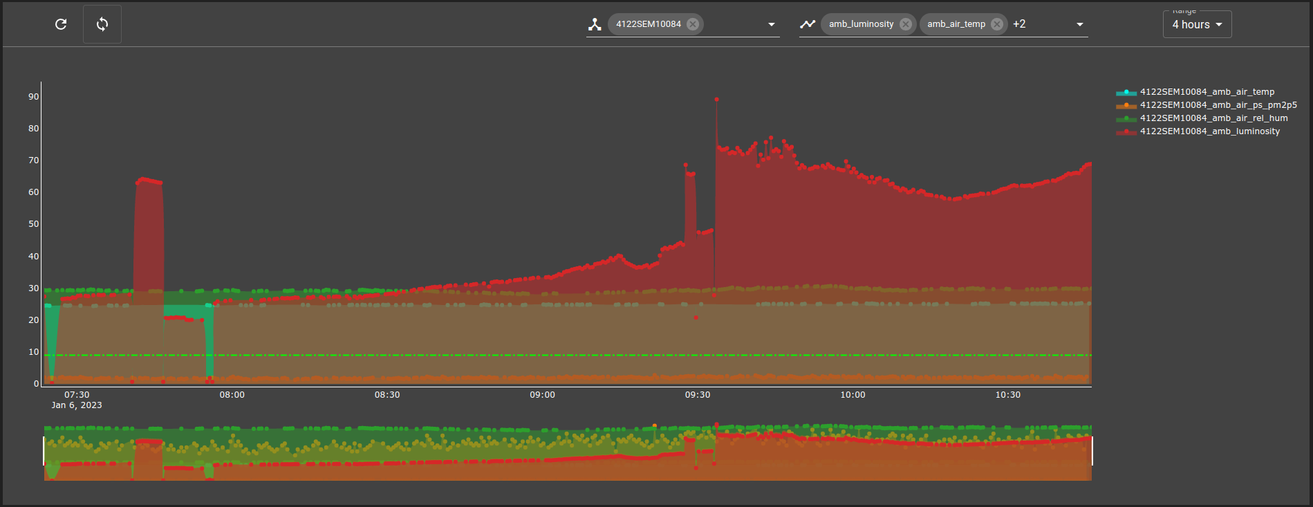
Stacked (Default): Each line of values are displayed on top of each other
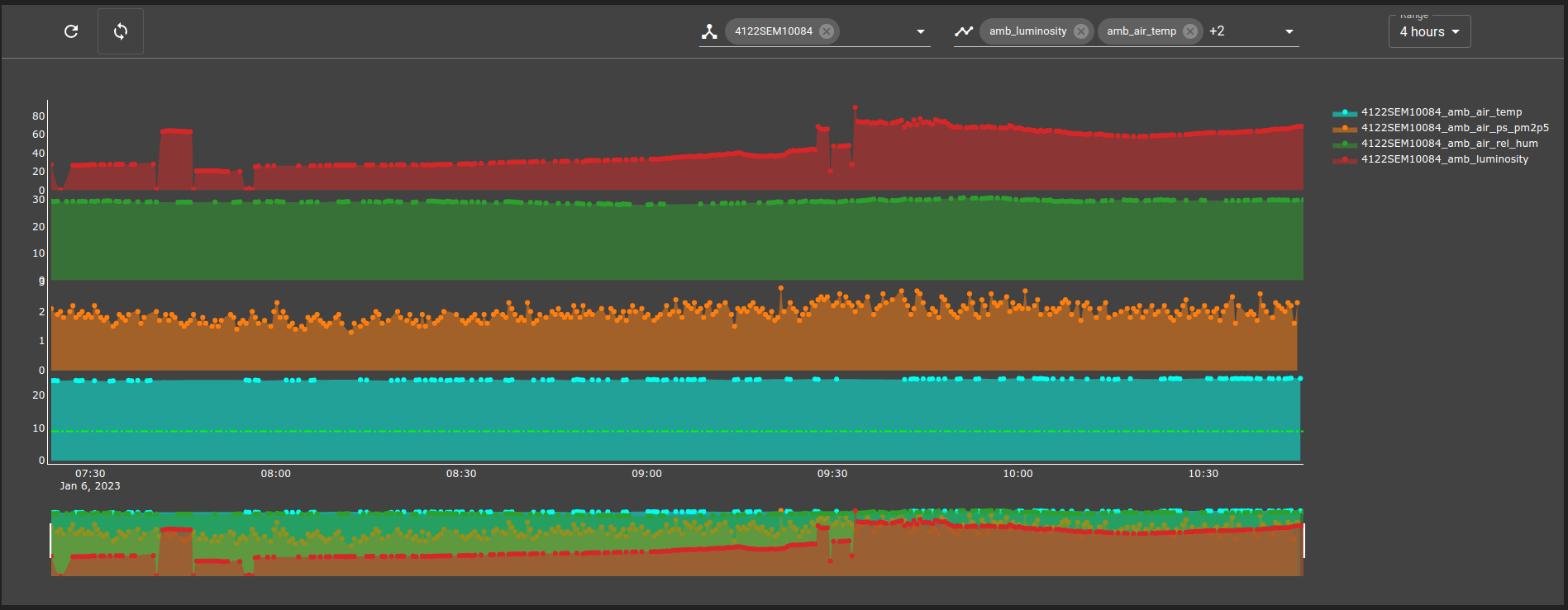
Separated: Each line is separated in another y axis
Use one of these dispositions according to the chart use case. Below an example of a chart once displayed Stacked and once displayed Separated.
Stacked
Separated
List of configuration files
Filename |
Short description |
Format |
Link to documentation |
|---|---|---|---|
dashboard.view#ChartWidget |
Defines the ChartWidget widget global settings |
json |
List of examples
Short description |
Link to documentation |
|---|---|
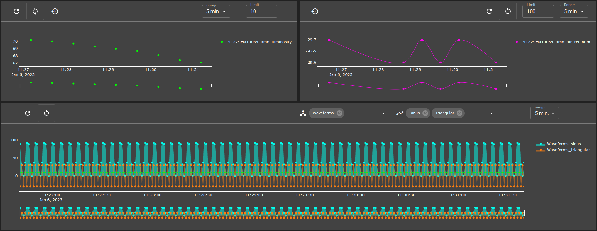
How to use a Toolbar widget to send actions to one or many charts. |
Features
Chart widget allow to display an analytic query results.
Examples of a Chart:
Settings
Setting |
Usage |
Type |
Default value |
query |
Query to request data |
query ID |
|
type |
Chart type |
Line, Area or Bar |
Line |
chartTitle |
Chart title |
string |
|
disposition |
Chart data disposition. Lines stacked on top of each other (default) or lines separated into multiple y axis. |
Stacked or Separated |
Separated |
yAxisTitle |
Title of the Y axis |
string |
|
xAxisRange |
X Axis range |
Range |
|
yAxisRange |
Y Axis range |
Range |
|
colors |
List of colors for every data serie |
string[] |
|
references |
List of shapes that can be added to act like references on the chart |
ChartReference[] |
|
showLines |
Display data with lines between points |
boolean |
true |
showDots |
Display data with dots where points are |
boolean |
true |
showLegends |
Display data legend |
boolean |
true |
showRangeSlider |
Display a range slider below the chart |
boolean |
true |
interpolation |
Interpolation function to display the data. See this link for examples |
linear, spline, hv, vh, hvh or vhv |
linear |
lineWidth |
Line width |
number |
3 |
editable |
Allow to edit the chart |
boolean |
false |
toolbar |
Chart toolbar |
Toolbar |
Range reference settings
Setting |
Usage |
Type |
Default value |
start |
Start of the range |
number |
|
end |
End of the range |
number |
Chart references settings
Setting |
Usage |
Type |
Default value |
orientation |
Orientation of the line |
Horizontal or Vertical |
Horizontal |
value |
Value to place reference, x value if orientation is vertical and y value if horizontal |
number |
|
stroke |
Color |
string |
|
width |
Line width |
number |
3 |
dash |
Style of the line |
solid, dot, dash, longdash, dashdot or longdashdot |
dash |
Example of a chart widget:
{
    "id": "44lu2S00",
    "type": "Chart",
    "title": "",
    "chartWidgetSettings": {
        "query": "root.analytics.query.temperature",
        "type": "Line",
        "colors": [
            "#00FFee",
            "#FF00ee"
        ],
        "references": [
            {
                "orientation": "Horizontal",
                "stroke": "#0F0",
                "value": 80
            },
            {
                "orientation": "Horizontal",
                "stroke": "#F00",
                "value": 60
            }
        ]
    }
}
Editable mode
With editable as true, you can modify the chart titles and move the references lines as you want. These modification will stay on as the chart receive new data but not when the front is reloaded.
Events
listen
The Chart widget can process these events :
auto: Receive and set the auto filter
rate: Receive and set the rate filter
range: Receive and set the range filter
date: Receive and set the date filter
restore: Restore defaults values
refresh: refresh chart data