Tables
Index
Tables are widget that allow to display and interact data in a table view.
Two types of table exist:
Alarm Table: The alarm table widget allows showing alarms with specified filters and view in a dashboard.
Collection Table: Collection table widgets allow showing collection elements with specified filters and view in the dashboard.
Both tables have unique concepts that are explained in detail in their specific documentation and general concepts that are available for both table types.
General concepts
Selection
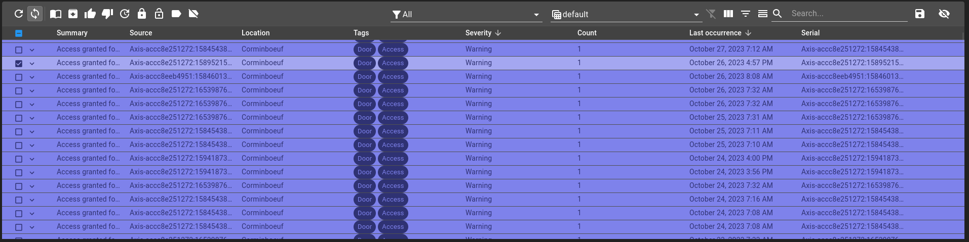
Rows can be selected the following ways:
Click
On row click with a single click, toggle single row selection, reset previous selection.
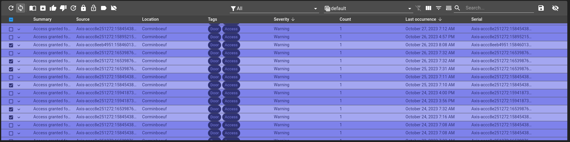
Selection before clicking
Selection after clicking
Ctrl-click
On row click with a single click holding control key, toggle selected row, keeping other selection.
Shift-click
On row click with two click holding shift key, selects all rows between begging and end rows, keeping other selection.
Drag-and-drop
On row click holding and releasing, selects all rows between beginning and end rows.
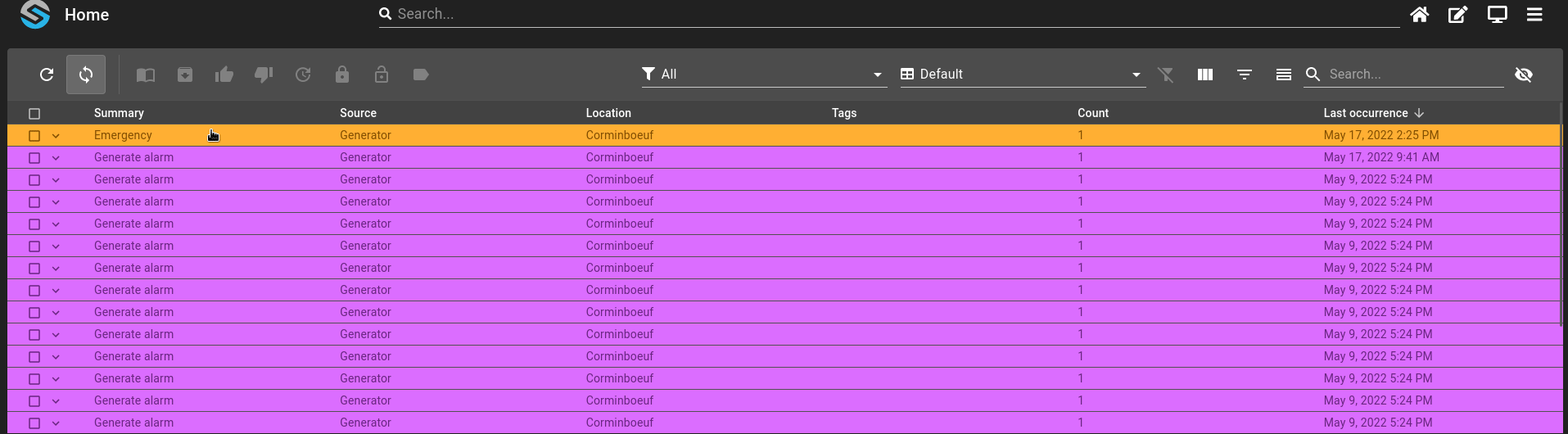
Toolbar
The table toolbar contains different actions, some unique to a table type and some are present in both:
Refresh
On the refresh icon click, you can refresh manually the table.
Filters and Views
You can apply one of the filters defined in your configuration. One of this filter can filter the content of the table based on multiple columns, in opposition to column specific filters that are only applied to the property the column represent.
Views define the structure of the table. It defines the different columns with options to filter or sort the content of the table.
The column views options are (in view):
formatter: specifies the date format (see https://day.js.org/docs/en/display/format). Used byTIMESTAMPrender.formatterExport: specifies the date Excel format export. Used byTIMESTAMPrender when exporting.disableTimezoneExport: disables user timezone usage when exporting to Excel format. The date will be displayed in UTC. Used byTIMESTAMPrender when exporting.schemaId: specifies the schema ID to use (ie. root.collection.schema) to query. Used byCOLLECTIONrender.format: specifies the property to display from schema ID. Used byCOLLECTIONrender.depth: specifies the depth at which to getnodesfrom. Used byCOLLECTIONrender.dependsOn: change the behavior of a column filter based on the content of another filter. Used byCOLLECTIONrender. Can be used withschemaIdanddepthto filter a query results based on another filter we made before.samePage: specifies whether to open URL in the same page or not (boolean value). Used byURLrender.
Change table structure
Three options can change the structure of the table:
Show/hide column: display the names of the columns at the top of the table, as well as an option to select/unselect all the rows.
Show/hide filter: display filters options for each column, depending on the type of value.
Show/hide summary: display a summary at the bottom of the table (ie: rows, count, sum of a column,…).
Search
You can search in the table by searching for a text (column with text value) or for a tag.
Export
The export button can export multiples rows into an excel file. Either export every row or export only the ones selected.
Show/Hide column
You can show or hide a particular column with the Show Column Chooser. These will also change depending on the view.
Clear filters
Remove all current filters and reset the default ones.