Form
Overview
List of configuration files
Filename |
Short description |
Format |
Link to documentation |
|---|---|---|---|
dashboard.view#FormWidget |
Defines the FormWidget widget global settings |
json |
List of examples
Short description |
Link to documentation |
|---|---|
Display the elements of a collection and use a form to edit |
|
Update value to change widgets colors |
|
Setup your configuration to gain access to collections rights |
Setup your configuration to gain access to collections rights |
Add rights to a form |
Features
Form widgets allow bindings (read and write) with OnSphere values. Bindings other values can be achieved by passing arguments to the form.
A form can be bound to a collection to insert/update an element of a collection. To use a form with collections, the form must submit with Request as its destination.
A form must be declared as form.web in root hierarchy. Its content defines :
data schema reference
UI shape
initial data
rights applied to parts of the form
value bindings
form submission mechanism
Form definition
To use the Form widget, you must first create a form.web file with the following content:
Name: The form name
Description: Description of the form
Bindings: Object matching bindings with leaves being reference to OnSphere
rootvalue path. Special case allows specifyingreadandwrite(both optional) to separate value reading from writingRights: Define a list of rights that can be used in this form UI schema to disable/enable/hide part of the UI, based on user form rights.
Schema: Id to a valid JSON schema describing the data form
schema.osppUI schema: A valid JSON UI schema describing the UI which interacts with the data
Initial value: Set initial value for the form
Submission: How the form is submitted
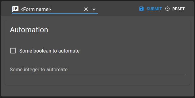
Example of a form with deferred value submission below:
{
    "moduleId": [
        "modules.web.web-1" // This depends on your web module(s)
    ],
    "name": "<Form name>",
    "description": "<Form description>",
    "rights": [],
    "bindings": {
        "all": {
            "variables": {
                "accessed": {
                    "by-your-form": "root.valid.onsphere.path"
                },
                "read-or-write": {
                    "read": "root.some.path.to.read",
                    "write": "root.some.path.to.write"
                }
            }
        }
    },
    "schema": "<schema osp path>",
    "ui": {
        "type": "Group",
        "label": "Automation",
        "elements": [
            {
                "type": "Control",
                "scope": "#/properties/all/properties/variables/properties/accessed/properties/by-your-form",
                "label": "Some boolean to automate"
            },
            {
                "type": "Control",
                "scope": "#/properties/all/properties/variables/properties/read-or-write",
                "label": "Some integer to automate"
            }
        ]
    },
    "initialValue": {
        "all": {
            "variables": {
                "accessed": {
                    "by-your-form": false
                }
            }
        }
    },
    "submit": {
        "destination": "Value",
        "type": "Deferred"
    }
}
Form file structure
Setting |
Usage |
Type |
Default value |
|---|---|---|---|
name |
The form name |
string |
|
description |
The form description |
string |
|
bindings |
The form bindings |
object |
|
rights |
The form rights |
string[] |
|
schema |
The form schema.ospp |
ItemId |
|
ui |
The form UI schema |
object |
|
initialValue |
The form initial values |
object |
|
submit |
The form submission |
Submit |
Bindings
Bindings offers a way to link a Value to an element of the UI schema, giving a way to show and modify the content of a Value. Special case allows specifying read and write (both optional) to separate value linked for reading and for writing.
Each key declared in the bindings object must be present in the schema, making them accessible as a scope for any UI elements.
{
    "bindings": {
        "all": {
            "variables": {
                "accessed": {
                    "by-your-form": "root.valid.onsphere.path"
                },
                "read-or-write": {
                    "read": "root.some.path.to.read",
                    "write": "root.some.path.to.write"
                }
            }
        }
    },
    "schema": "<schema osp path>",
    "ui": {
        "type": "Group",
        "label": "Automation",
        "elements": [
            {
                "type": "Control",
                "scope": "#/properties/all/properties/variables/properties/accessed/properties/by-your-form",
                "label": "Some boolean to automate"
            },
            {
                "type": "Control",
                "scope": "#/properties/all/properties/variables/properties/read-or-write",
                "label": "Some integer to automate"
            }
        ]
    }
}
Rights
Rights allow to modify the structure of a form depending on the user trying to access it. For each element of the UI schema, you can define an objects rights to define the level of access for a specific right. In addition, each of those rights must be defined in the rights property. Each right can be set as either :
none: hide the element by removing it from the formread: allow the user to see this element and the data linked to it but doesn’t let him modify themwrite: full access to the element and the data
"rights": ["user", "admin"],
"ui": {
        "type": "Group",
        "label": "Automation",
        "elements": [
            {
                "type": "Control",
                "scope": "#/properties/all/properties/variables/properties/accessed/properties/by-your-form",
                "label": "Some boolean to automate",
                "rights": {
                  "user": "read",
                  "admin": "write"
                }
            },
            {
                "type": "Control",
                "scope": "#/properties/all/properties/variables/properties/read-or-write",
                "label": "Some integer to automate"
            }
        ]
    },
When a user request a form, we fetch the user form rights and compare them to the declared rights for each UI element. If the UI element doesn’t have any declared rights, it will be fully visible and editable for any user. Otherwise, if the element has any right defined, we compare them to the user form rights and determine the outcome:
The user doesn’t have any of the declared rights for this UI element, then the UI element is hidden (use right level
noneas default).The user have one of the declared rights for this UI element, then we change the UI element according to this right level.
The user have multiple of the declared rights for this UI element, then we change the UI element according to the higher right level he has.
Submission
Submission declares how and where the form data are saved and submitted. These two aspects are define by the properties type (how) and destination (where).
How
Form submission can have two types:
Immediate: Upon any modification in the form, the data are saved and emitted to the given destinationDeferred: The data are saved and emitted only when a user clicks on a submit widget on which the form is subscribed to. One is created by default and is present in the form toolbar.
Where
Form submission can have one of the four following destination:
Value: The form data is published to the values that are linked to the different UI elements through form bindings.Action: All data content will be posted to an action running a script. You can access the content of the form using theparameters[0]attribute (parameters is an array where the first index contains the form data).Mixed: Acts asValueandActionmixed. Values are updated and data are sent to a script through an actionRequest: The value of the form is sent through the collections websocket to attempt the creation/update of a collection element.
Warning
When using Mixed, the order for updating Value and executing Action is undefined ! Values may be updated after action execution. If you use an Action to trigger a script, you may have old values if you attempt to directly read a value content. You can get the up to date content of the values by using trigger.parameters[0].
Example of form properties:
{
  "moduleId": [
      "modules.web.web-1"
  ],
  "name": "Name of form",
  "description": "",
  "schema": "root.schema",
  "submit": {
      "action": "<action osp path>",
      "script": "<script osp path>",
      "destination": "Action",
      "type": "Deferred"
  }
}
And then you can access any property declared in the schema with the following code in a script:
let triggerContent = trigger.parameters[0];
log.info("Value: " + triggerContent.led_luminosity) // Where **led_luminosity** is a property of the schema
Submit structure
Value
Setting |
Usage |
Type |
Default value |
|---|---|---|---|
destination |
Value destination |
Value |
|
type |
Form submission |
Immediate or Deferred |
Request
Setting |
Usage |
Type |
Default value |
|---|---|---|---|
destination |
Request destination |
Request |
|
type |
Form submission |
Immediate or Deferred |
Action/Mixed
Setting |
Usage |
Type |
Default value |
|---|---|---|---|
destination |
Action destination |
Action or Mixed |
|
type |
Form submission |
Immediate or Deferred |
|
action |
Form action to perform |
Valid RUN_SCRIPT action reference |
|
script |
Form script to call |
Valid script reference |
UI components
UI forms are generated through ui definitions. Two element types are available:
Control elements: They manage values bound to schema definition
Layout elements: They allow organizing elements
Control elements
Control are described in following documentation.
Control elements require a scope element referring the data bindings. More settings such as label and various options can be setup for each control element.
Based on JSON schema type, different render will be used. They are described in depth in following documentation.
Depending on data, it is possible to show, hide, disable or enable the control element. They are described in following documentation.
It is also possible to modify the control element by using form rights.
More control elements are supported in OnSphere. They are described in the following sub sections.
Override basic types
Note
By default, form will automatically detects what UI component to show. Some edge cases might need to override its detection by providing which component to show.
Overriding basic types might be needed when you face ['string', 'boolean', 'number'] type definition, for example. The library will not be able to properly bind it to the desired UI.
For this, you can provide, in options:
Setting |
Usage |
Type |
Default value |
|---|---|---|---|
render |
Override type definition |
|
Usage:
{
  "type": "Control",
  "scope": "#/properties/multipleTypeValue",
  "label": "Value",
  "options": {
    "render": "string"
  }
}
Collection: Checkbox group
Checkbox group allows you to bind collections values to a checkbox group as shown below.

The options settings are:
Setting |
Usage |
Type |
Default value |
|---|---|---|---|
schema* |
Schema reference ID to query |
schema.ospp path |
|
format* |
Input list value format |
Variable replacement string |
|
sorts |
Sorting applied to input list |
Sorting operation as {“field”: “<field-name>”, “operation”: “<ASC or DESC>”} |
|
freeInput |
Whether the user can also input value not available in linked collection (will not add value to collection) |
boolean |
false |
dependsOn |
Link other collection combo box to act as multi level queries (requires specific format) |
string array |
[] |
Usage:
{
  "type": "CheckboxGroup",
  "scope": "#/properties/recipients",
  "label": "Recipients",
  "options": {
    "schema": "root.collections.recipients",
    "format": "${name}",
    "sorts": [{ "field": "name", "operation": "ASC" }]
  }
}
The recipient schema is:
{
  "schema": {
    "type": "object",
    "properties": {
      "name": {
        "type": "string"
      }
    },
    "required": [
      "name"
    ]
  }
}
Collection: Combo box
Collection combo box allows user to pick a dynamic value from a collection.

The options settings are:
Setting |
Usage |
Type |
Default value |
|---|---|---|---|
schema* |
Schema reference ID to query |
schema.ospp path |
|
format* |
Input list value format |
Variable replacement string |
|
sorts |
Sorting applied to input list |
Sorting operation as {“field”: “<field-name>”, “operation”: “<ASC or DESC>”} |
|
freeInput |
Whether the user can also input value not available in linked collection (will not add value to collection) |
boolean |
false |
dependsOn |
Link other collection combo box to act as multi level queries (requires specific format) |
string array |
[] |
Usage:
{
  "type": "Collection",
  "scope": "#/properties/priority",
  "label": "Priorité",
  "options": {
    "schema": "root.chv.collections.priorities",
    "format": "${name}",
    "sorts": [{ "field": "name", "operation": "ASC" }]
  }
}
The priority schema is:
{
  "schema": {
    "type": "object",
    "properties": {
      "name": {
        "type": "string"
      },
      "colorBg": {
        "type": "string"
      },
      "colorFg": {
        "type": "string"
      }
    },
    "required": [
      "name"
    ]
  }
}
Depends on
Collection input list using dependsOn must follow below structure to work. It allows user to create combo box hierarchy.
{
    "name": "Some value",
    "nodes": [{
        "name": "Some children",
        "nodes": [{
            "name": "Some sub-children",
            "nodes": []
        }]
    }, {
        "name": "Another children",
        "nodes": [{
            "name": "Another sub-children",
            "nodes": []
        }]
    }]
}
The following example shows how 4 input list linked together can be used. It uses the hierarchy: site > building > floor > premise.
{
  "type": "HorizontalLayout",
  "elements": [
    {
      "type": "Collection",
      "scope": "#/properties/site",
      "label": "Site",
      "options": {
        "schema": "root.collections.site",
        "format": "${name}",
        "dependsOn": [],
        "sorts": [{ "field": "name", "operation": "ASC" }]
      }
    },
    {
      "type": "Collection",
      "scope": "#/properties/building",
      "label": "Building",
      "options": {
        "schema": "root.collections.site",
        "format": "${name}",
        "dependsOn": ["site"],
        "sorts": [{ "field": "name", "operation": "ASC" }]
      }
    },
    {
      "type": "Collection",
      "scope": "#/properties/floor",
      "label": "Floor",
      "options": {
        "schema": "root.collections.site",
        "format": "${name}",
        "dependsOn": ["site", "building"],
        "sorts": [{ "field": "name", "operation": "ASC" }]
      }
    },
    {
      "type": "Collection",
      "scope": "#/properties/premise",
      "label": "Premise",
      "options": {
        "schema": "root.collections.site",
        "format": "${name}",
        "dependsOn": ["site", "building", "floor"],
        "freeInput": true,
        "sorts": [{ "field": "name", "operation": "ASC" }]
      }
    }
  ]
}
Collections: collections rights
Collections rights allows user to define a list of collections rights. This component is meant to be use with rights collections. For any given collection, you can:
set if the user can create an new entry
set if the user can read the entries of the collection
set if the user can update any entry
set if the user can delete any entry
set a list of properties that can be modified by a user when updating any entry
set a list of the entries the user has access
set a list of filters that the entries must match in order to be accessible for the user
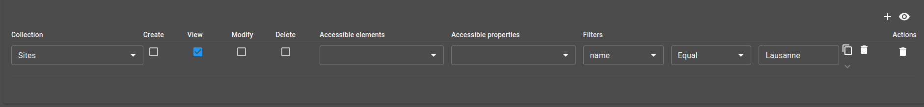
Usage:
{
  "type": "CollectionsRights",
  "scope": "#/properties/collections",
  "label": "Collections rights"
}
The property collections must have the required properties. You can look at the property collections of the user rights schema validator to get the list of required properties.
Collections: collection rights selector
This selector is a simpler version of collections rights component. This allows you to set the list of the entries the user has access without having to deal with the rest of the rights.
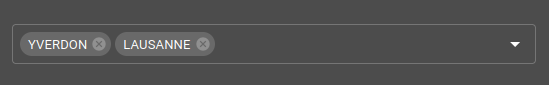
The options settings are:
Setting |
Usage |
Type |
Default value |
|---|---|---|---|
schema* |
ItemId of the targeted collection schema |
ItemId |
|
canCreate |
set if the user can create an new entry |
boolean |
false |
canRead |
set if the user can read the entries of the collection |
boolean |
true |
canUpdate |
set if the user can update any entry |
boolean |
false |
canDelete |
set if the user can delete any entry |
boolean |
false |
Usage:
{
  "type": "ServiceCollectionRights",
  "scope": "#/properties/collections",
  "label": "Sites",
  "options": {
    "schema": "root.chv.collections.site"
  }
}
The property collections must have the required properties. You can look at the property collections of the user rights schema validator to get the list of required properties.
Collections: forms rights selector
Forms rights selector allows user to define a list of form rights. This component is meant to be use with rights collections.
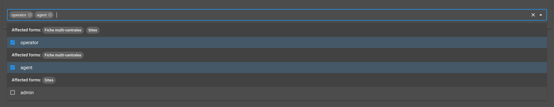
The options settings are:
Setting |
Usage |
Type |
Default value |
|---|---|---|---|
limitTags |
Maximum tags shown in the component when closed. Doesn’t limit the number of selected elements. |
number |
6 |
Usage:
{
  "type": "FormsRightsSelect",
  "scope": "#/properties/forms",
  "label": "Forms rights",
  "options": {
      "limitTags": 6
  }
}
Color picker
Color picker allows user to input color.
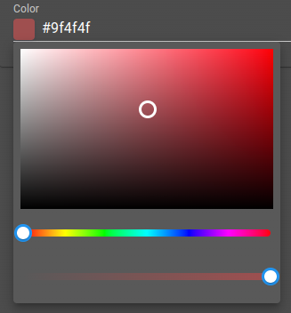
The options settings are:
Setting |
Usage |
Type |
Default value |
|---|---|---|---|
format |
Color picker format |
hex, hsl, hsv, rgb, hex8 |
hex |
Usage:
{
  "type": "Color",
  "scope": "#/properties/color",
  "label": "Color",
  "options": {
    "format": "hsl"
  }
}
Journal widget
Journal widget allow user to input entries with their user, timestamp and message.
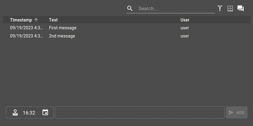
The options settings are:
Setting |
Usage |
Type |
Default value |
|---|---|---|---|
journalWidgetSettings |
Journal widget settings |
||
height |
Journal widget height |
CSS height |
300px |
To use the journal widget, your data must be formatted as follow:
{
  "journal": {
    "type": "array",
    "items": {
      "type": "object",
      "properties": {
        "id": { "type": "string" },
        "user": { "type": "string" },
        "text": { "type": "string" },
        "timestamp": { "type": "number" }
      }
    }
  }
}
And the ui element:
{
  "type": "Journal",
  "scope": "#/properties/journal",
  "label": "Journal",
  "options": {
    "height": "400px",
    "journalWidgetSettings": {
      "type": "Table",
      "inputMethod": "TimestampMessage",
      "actionsPosition": "top",
      "timestampSort": "asc",
      "autoFocus": false
    }
  }
}
Open/Close week scheduler
Open/close week scheduler allows to create open/close time for day of the week.
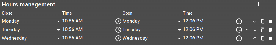
The options settings are:
Setting |
Usage |
Type |
Default value |
|---|---|---|---|
inverse |
Whether to inverse open to close and so forth |
boolean |
false` |
duplicable |
Whether to allow row duplication |
boolean |
true |
dayDelta |
When the start of the week occurs (-1 starts on Sunday) |
number |
0 |
labelOpen |
Label for the open table heading |
string |
|
labelClose |
Label for the close table heading |
string |
|
labelTime |
Label for the time table heading |
string |
To use the journal widget, your data must be formatted as follow:
{
  "openingHours": {
    "type": "array",
    "items": {
      "type": "object",
      "properties": {
        "openDay": { "type": "number" },
        "closeDay": { "type": "number" },
        "openTime": { "type": "string" },
        "closeTime": { "type": "string" }
      }
    }
  }
}
And the ui element:
{
  "type": "OpenCloseWeekScheduler",
  "scope": "#/properties/openingHours",
  "label": "Hours management",
  "options": {
    "labelOpen": "Close",
    "labelClose": "Open",
    "dayDelta": -1
}
Day selector
This component is the same one used to select the open or close day in the Open/Close week scheduler. Returns the selected day as a number, 0 being Monday and 6 being Sunday. You can shift these values by using the dayDelta parameter.
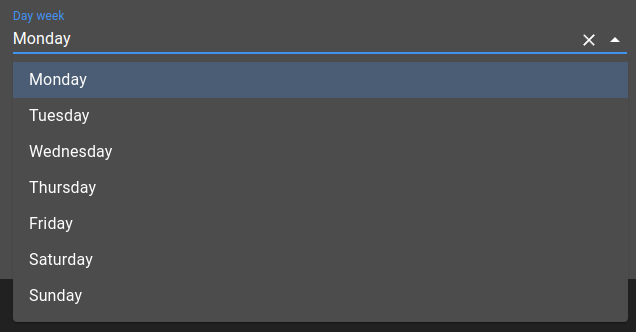
The options settings are:
Setting |
Usage |
Type |
Default value |
|---|---|---|---|
dayDelta |
When the start of the week occurs (-1 starts on Sunday) |
number |
0 |
To use this component, define the ui element with type WeekDaySelector:
{
  "type": "WeekDaySelector",
  "scope": "#/properties/dayWeek",
  "label": "Day",
  "options": {
    "dayDelta": 0
  }
}
Time selector
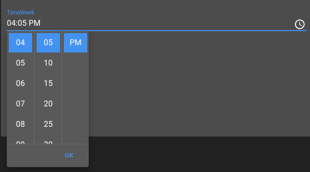
This component is the same one used to select the open or close hour in the Open/Close week scheduler. Returns the given hour as a string like ‘00:00’.
This component doesn’t have any options.
To use this component, define the ui element with type WeekTimeSelector:
{
  "type": "WeekTimeSelector",
  "scope": "#/properties/timeWeek",
  "label": "Time"
}
Filters builder
This component allows to build a filter, using AND and OR operations to combine multiple filters and create a more complex one. The main goal of this component is to be able to define a filter in a collection and use that collection in a JS or Lua script to check if a given alarm or collection element match the filter.
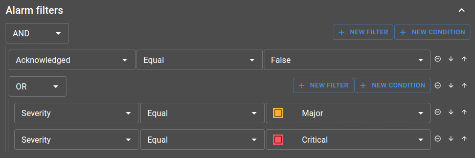
Those filters are either based on a alarm or a collection view, defining the fields that you can pick from when describing the filter.
To either work with alarms or collection, you can choose from two component:
AlarmsFilterBuilderCollectionsFilterBuilder
Both component need to have a view provided by them, but they don’t expect the exact same thing:
AlarmsFilterBuilder: setviewin options with an alarm view.web id.CollectionsFilterBuilder: setviewin options with a collection view id, referenced in the schema.web file. Alongside the view, you need to specify theschemathat possess thatview.
Other options are available for both, such as open and allowClose that can determine the default behaviour of the component collapse part.
A common example you should check out if you want to use this component is the Define alarms silencing rules with collections example, showing how to silence an alarm if it match at least one of the rules (filters) define in a collection.
Layout elements
Layout elements allow elements organization. They are described in the following documentation.
Widget
Once setup, the form can be bound to a Form widget with the following configuration:
{
    "type": "Form",
    "id": "DDReTUpc",
    "title": "",
    "formWidgetSettings": {
        "form": "root.forms.test",
        "options": {
            "useDefault": true
        },
        "toolbar": {
            "type": "Toolbar",
            "id": "DDReTUpc_toolbar",
            "toolbarWidgetSettings": {
                "type": "Form",
                "position": "Top",
                "submitSettings": {
                    "disableSubmit": false,
                    "disableReset": false,
                    "disableSaveFeedback": false
                },
                "formSelectSettings": {
                    "type": "Form",
                    "defaultOption": "root.forms.test",
                    "icon": "speaker_notes"
                }
            }
        }
    }
}
Settings
Setting |
Usage |
Type |
Default value |
|---|---|---|---|
form |
The form reference to load |
form ID |
|
options |
The form options |
object |
|
toolbar |
The form toolbar |
object |
Options
Setting |
Usage |
Type |
Default value |
|---|---|---|---|
useDefault |
Use default value from JSON schema defined in value |
boolean |
true |
Toolbar
Setting a toolbar of type Form will display a form Select as well as a form Submit widget.
Select
Form select allows the user to select which Form to display.
Submit
Form submit allows the user to send Form to interact with OnSphere.
Events
emit
The Form widget send these events :
formLoaded: Indicates the form has been loaded with associatedform.webinformationformUpdate: Indicates a form update
listen
The Form widget can process these events :
formSet: Sets form with provided initial valueformSave: Performs save operation based onform.websubmit specificationformReset: Performs reset operation
Event formSet can be used to feed from the menu, for example:
{
    "label": "Load form",
    "icon": "format_quote",
    "context": [
        {
            "scopes": [
                "Click",
                "Toolbar"
            ],
            "type": "AlarmTable",
            "output": [
                {
                    "operation": "evaluate",
                    "input": {
                        "code": {
                            "expression": "osp.widgets('DDReTUpc').setForm({'form':'root.forms.demo', 'initialData': ${alarms.clicked}})"
                        }
                    }
                }
            ]
        }
    ]
}