Value
Overview
List of configuration files
Filename |
Short description |
Format |
Link to documentation |
|---|---|---|---|
dashboard.view#ValueWidget |
Defines the ValueWidget widget global settings |
json |
Features
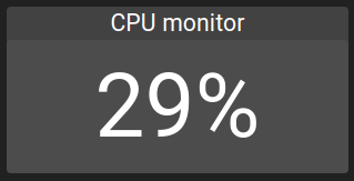
Value widget allows displaying a value along a label describing the value.
Examples of a Value:
Settings
Following settings can be used to configure a Value widget:
Setting |
Usage |
Type |
Default value |
|---|---|---|---|
reference |
The value to display |
value ID |
|
fillColor |
Text color |
string |
|
backgroundColor |
Background color |
string |
|
label |
The label to show for the gauge (or disable) |
string / boolean |
|
labelPosition |
Label position |
“TOP”, “BOTTOM”, “LEFT” or “RIGHT” |
“TOP” |
labelPercent |
The label height in percent |
0-100 |
20 |
text |
Text with sprintf in JS support which allows to specify the format of the value |
string |
%d%%` |
Example of a Value configuration:
{
    {
      "type": "Value",
      "id": "id",
      "title": "Text",
      "valueWidgetSettings": {
        "text": "%d%%",
        "backgroundColor": "#424242",
        "reference": "root.variables.waveforms.waveforms-1",
        "label": "CPU monitor",
        "labelPosition": "TOP",
        "labelPercent": 20
}
Data source requirements
For the value to work, use the following data source pipeline:
Authentication (optional)
Value store