Schematic
Overview
List of configuration files
Filename |
Short description |
Format |
Link to documentation |
|---|---|---|---|
dashboard.view#SchematicWidget |
Defines the SchematicWidget widget global settings |
json |
Capabilities for advanced editing
Capabilities |
Support front-end |
Support composer |
Comment |
|---|---|---|---|
Standard mxgraph library with existing shape can be imported statically (no update propagation). |
The content of model is copied inside the schematic. |
||
New shape can be created and imported from a standard xml format. |
This is expected to be added in the future. |
||
New shape can be created and imported from a standard js format. These shape can include a state managed and change base on a value. |
This is expected to be added in the future. |
||
Standard mxgraph library with existing shape can be imported dynamically (update propagation) |
This is expected to be added in the future. |
Features
Schematic widgets let the user draw shapes and show interaction with values from OnSphere.
The rendering engine is done using MxGraph.
To create a schematic in the configuration, we use Visual Studio Code with Draw.io Integration.
First, create a file with “.drawio” extension, then open it with Visual Studio Code.
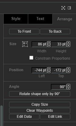
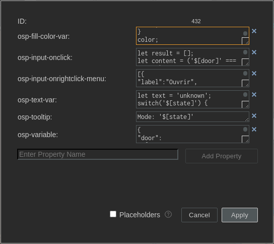
All bindings/interactions can be added on shapes/stencils through the Edit data menu (or Ctrl + M when selecting a shape)

Each bindings/interactions must be added on its own as shown by below figure.

Bindings
The following bindings are available:
osp-text(expect a string) which allows updating cells text valueosp-state-visible(expect a boolean) which allows updating cells visibilityosp-fill-color(expect a CSS color) which allows updating cells fill colorosp-fill-opacity(expect an integer between 0 and 100) which allows updating cells fill opacityosp-stroke-opacity(expect an integer between 0 and 100) which allows updating cells stroke opacityosp-opacity(expect an integer between 0 and 100) which allows updating cells opacityosp-border-color(expect a CSS color) which allows updating border color
Whatever is put the binding will be evaluated. When the last part evaluated is a statement, the value will change the binding.
For example:
osp-text: let text = 'unknown';
switch('${root.office.door.state.mode}') {
case 'LOCKED':
text = 'Débloquer';
break;
case 'UNLOCKED':
text = 'Bloquer';
break;
}
text;
osp-fill-color: let color = '#6da7ff';
switch('${root.office.door.state.mode}') {
case 'LOCKED':
color = '#61c05e';
break;
case 'UNLOCKED':
color = '#ff3200';
break;
}
color;
Interactions
The following interactions are available:
osp-input-onclickwhich reacts to left clickosp-input-onrightclickwhich reacts to right clickosp-tooltipwhich reacts to mouse hoverosp-input-onclick-menuwhich reacts to left click menuosp-input-onrightclick-menuwhich reacts to right click menu
For touch interaction, following mapping is done:
osp-input-onclickis mapped to the touch eventosp-input-onrightclick-menuis mapped to the tap and hold event
For example:
osp-input-onclick: let result = [];
let content = ('${root.office.door.control.lock}' === 'true') ? false : true;
result.push({id:'root.office.door.control.lock', content:content});
osp.send(result);
"osp-menu": [
  {
    "label": "Ouvrir",
    "icon": "timer",
    "command": "osp.send({id:'root.office.door.control.action', content:'open'});"
  },
  {
    "label": "Verrouiller",
    "icon": "lock",
    "command": "osp.send({id:'root.office.door.control.action', content:'lock'});"
  },
  {
    "label": "Deverrouiller",
    "icon": "lock_open",
    "command": "osp.send({id:'root.office.door.control.action', content:'unlock'});"
  }
]
Menu format is:
{
type ShowDynamicMenuType = {
    label: string,
    icon?: string,
    command?: string,
    confirmation?: {
        message?: string,
        acceptLabel?: string,
        cancelLabel?: string
    },
    closeAfterInteraction?: boolean
}
When confirmation object is present, it will prompt the user with a dialog window.
Context
When evaluating interaction, it is possible to use the context to update value and schematic.
The context contains the following methods to interact with:
osp.widgets(id): to access any widget available in current dashboard using widgetid. This will allow access to widget exposed features.osp.navigate(path)to navigate to any dashboard (path format:root.dashboard.path) (previouslyosp.navigateTo, still supported)osp.evaluate(code): to allow menucodeinteraction evaluation (see dynamic evaluation)osp.send(jsonMessage)to update a value or an array of value with their respective contentjsonMessageosp.moveTo(id)to move schematic camera to a cellidin current schematicosp.setLayer(id, flag)to set/unset layeridas shown/hiddenflagosp.setPage(id)to set update current schematic pageidosp.alarmSeverity(number)to retrieve alarm severity for givennumberosp.alarmSeverityId(id)to retrieve alarm severity for givenid(i.e.root.alarms.severities.clear)
Example:
"osp-menu": [
  {
    "label": "Afficher interactions",
    "icon": "visibility",
    "command": "osp.setLayer('321', true);",
    "confirmation": {}
  },
  {
    "label": "Cacher interactions",
    "icon": "visibility_off",
    "command": "osp.setLayer('321', false);",
    "confirmation": {}
  },
  {
    "label": "Aller au hotspot",
    "icon": "local_cafe",
    "command": "osp.moveTo('349');",
    "confirmation": {}
  },
  {
    "label": "Aller au tech",
    "icon": "build",
    "command": "osp.moveTo('351');",
    "confirmation": {}
  }
]
Alarm severity
Alarm severity object returned by osp.alarmSeverity and osp.alarmSeverityId has the following fields:
Field |
Usage |
Type |
|---|---|---|
id |
Alarm severity ID |
string |
name |
Alarm severity name |
string |
description |
Alarm severity description |
string |
fallback |
Whether the alarm severity is by default or not |
boolean |
severity |
The alarm severity level |
number |
fgColor |
Alarm severity foreground color |
string |
bgColor |
Alarm severity background color |
string |
fgHiColor |
Acknowledged alarm severity foreground color |
string |
bgHiColor |
Acknowledged alarm severity background color |
string |
Labels
Labels display is depend on how integrator chooses it to be displayed. By default a label has the following settings active (visible in Text tab in draw.io) :
Word Wrap: whether the label wraps in the shape or notFormatted Text: whether to handle text as HTML label
For more information on these settings, see https://www.drawio.com/doc/faq/line-breaks.
To disable handling labels as HTML, either remove the checkbox for both Word Wrap and Formatted Text or use disableLabelAsHtmlDetection settings in Schematic widget settings.
Variables
It is possible to declare, for each shape, a JSON object which contains fixed variables with osp-variable property. You can use declared variables in each interaction and binding.
To access the variable content, use $[variable_name].
They are evaluated at schematic initialization.
Example
{
"door": "${root.office.door.control.lock}",
"door-write": "root.office.door.control.lock",
"state": "${root.office.door.state.mode}",
"action-write": "root.office.door.state.action"
}
osp-input-onclick:
let result = [];
let content = ('$[door]' === 'true') ? false : true;
result.push({id:'$[door-write]', content:content});
osp.send(result);
osp-fill-color:
let color = '#6da7ff';
switch('$[state]') {
case 'LOCKED':
color = '#61c05e';
break;
case 'UNLOCKED':
color = '#ff3200';
break;
}
color;
Local storage
When local storage is activated, the following parameters are stored:
Schematic position
Schematic zoom level
Schematic active page