Gauge

Overview

List of configuration files

Filename

Short description

Format

Link to documentation

dashboard.view#GaugeWidget

Defines the GaugeWidget widget global settings

json

Link

Features

Gauge widget allow binding a value to a tile in a dashboard. It displays numeric and decimal value with a bounding range.

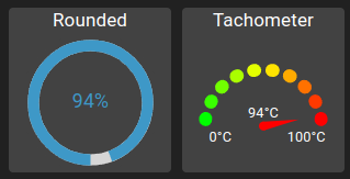
2 different types of gauge exists:

  • Rounded: Gauge displayed as a circle

  • Tachometer: Gauge displayed as a tachometer, with min and max value displayed

Example of both gauge widget types:

../../../_images/osp-gauge-widget-with-tachometer.png

It consists of two parts:

  • Gauge: The gauge itself which shows an indicator with current value in reference to min-max bounding range

  • Label: A label to describe the gauge content (optional)

Shared parameters

The following parameters are shared by both gauge types:

Setting

Usage

Type

Default value

type

Type of the gauge

“Rounded” or “Tachometer”

“Rounded”

reference

The value to display the gauge

value ID

min

The minimal value corresponding to 0%

number

0

max

The maximal value corresponding to 100%

number

100

backgroundColor

The gauge background color

string

#424242

label

The label to show for the gauge (or disable)

string / boolean

labelPosition

Whether to show the label at the top or bottom

“top” or “bottom”

“top”

labelPercent

The label height in percent

0-100

15

text

Text with sprintf in JS support which allows to specify the text displayed in the center of the gauge

string

%d%%

Rounded gauge parameters

The following parameters are specific for Rounded gauges:

Setting

Usage

Type

Default value

textColor

The text color to display the formatted value in the center of the gauge

string

#3e98c7

fillColor

The filled part of the gauge color

string

#3e98c7

emptyColor

The empty part of the gauge color

string

#d6d6d6

iconColor

The icon color displayed in the center of the gauge

string

#3e98c7

strokeLinecap

The shape of the filled gauge beginning/end endpoints

“butt” or “round”

“butt”

fillRotation

The starting point for the gauge (0 == top, 0.25 == left, 0.5 == bottom, 0.75 == right)

0-1

0.5

icon

The icon based on Material-UI listing displayed in the center of the gauge

string

counterClockwise

Whether the gauge rotates counter clockwise or not

boolean

false

strokeWidth

The stroke width in respect to widget size

0-100

8

backgroundPadding

The amount of padding around the gauge

number

5

Example of a Rounded gauge:

{
"gaugeWidgetSettings": {
    "type": "Rounded",
    "min": 0,
    "max": 100,
    "labelPosition": "TOP",
    "labelPercent": 15,
    "label": "Rounded",
    "reference": "root.variables.waveforms.waveforms-1",
    "textColor": "#3e98c7"
}

Tachometer gauge parameters

The following parameters are specific for Tachometer gauges:

Setting

Usage

Type

Default value

colors

Array of colors used to display each arc. Specify one color per interval or specify a start and an end color, the other colors are interpolated between those. The interpolation is done using d3.interpolateHsl

string[]

[“#00FF00”, “#FF0000”]

interval

Length of an interval (100/interval = number of intervals)

number

5

needleColor

Color of the needle tip. If not defined, color is is the same as the arc the needle is pointing at

string

needleBaseColor

Color of the needle base. If not defined, color is is the same as the arc the needle is pointing at

string

Example of a Tachometer gauge:

{
"gaugeWidgetSettings": {
    "type": "Tachometer",
    "reference": "root.variables.waveforms.waveforms-2",
    "min": -100,
    "max": 100,
    "text": "%d°C",
    "labelPosition": "TOP",
    "labelPercent": 15,
    "label": "Tachometer",
    "backgroundColor": "#424242",
    "colors": [
        "#00FF00",
        "#FF0000"
    ],
    "interval": 20
}

Data source requirements

For the gauge to work, use the following data source pipeline:

  • Authentication (optional)

  • Value store