Basic Input Output Value
Overview
List of configuration files
Filename |
Short description |
Format |
Link to documentation |
|---|---|---|---|
dashboard.view#BasicInputOutputValueWidget |
Defines the BasicInputOutputValueWidget widget global settings |
json |
List of examples
Short description |
Link to documentation |
|---|---|
Update a variable to trigger an alarm |
Features
Basic I/O widget allows binding a value to a tile in a dashboard, both to display and to set its content.
Following types are available:
Boolean
Integer
Decimal
Text
Example of basic I/O widget:
It consists of three main parts:
Label: The widget label shown on top
Icon: An icon that best represents the value
Value: A description of the value
The following parameters can be used for any value type:
Setting |
Usage |
Type |
Default value |
label |
Widget label displayed on top |
string |
|
showLabel |
Whether the label is shown or not |
boolean |
true |
tooltip |
Displays the tooltip text upon widget hovering |
string |
|
showTooltip |
Whether the tooltip is shown or not |
boolean |
true |
icon |
Displays the icon based on Material-UI listing |
string |
|
showIcon |
Whether the icon is shown or not |
boolean |
true |
showValue |
Whether the value is shown or not |
boolean |
true |
foregroundColor |
Widget foreground color (text, icon) |
string |
|
backgroundColor |
Widget background color |
string |
|
variableText |
A sprintf in JS which allows to specify how the value is shown |
string |
|
unknownValueText |
Displays the text when value is |
string |
|
unknownIcon |
Displays the icon when the value is |
string |
|
unknownForegroundColor |
Widget foreground color (text, icon) when the value is |
string |
|
unknownBackgroundColor |
Widget background color when the value is |
string |
Only one value subscription is allowed for the basic I/O widget.
Basic I/O widget settings definition :
export type BasicWidgetSettings = {
    label?: string,
    showLabel?: boolean,
    tooltip?: string,
    showTooltip?: boolean,
    icon?: string,
    showIcon?: boolean,
    showValue?: boolean,
    foregroundColor?: string,
    backgroundColor?: string,
    variableText?: string,
    unknownValue?: any,
    maxValue?: any,
    minValue?: any,
    onValue?: any,
    offValue?: any,
    onValueText?: string,
    offValueText?: string,
    unknownValueText?: string,
    unknownIcon?: string,
    onIcon?: string,
    offIcon?: string,
    addIcon?: string,
    removeIcon?: string,
    unknownForegroundColor?: string,
    onForegroundColor?: string,
    offForegroundColor?: string,
    unknownBackgroundColor?: string,
    onBackgroundColor?: string,
    offBackgroundColor?: string,
    valueStep?: number,
    textInputLabel?: string,
    textAcceptIcon?: string,
    textAcceptForeground?: string,
    textAcceptBackground?: string,
    textCancelIcon?: string,
    textCancelForeground?: string,
    textCancelBackground?: string,
};
Boolean widget
The following parameters can be used for boolean value type:
Setting |
Usage |
Type |
Default value |
unknownValue |
Used to set the boolean value when value is |
boolean |
|
onValueText |
Text displayed when the value is |
string |
|
offValueText |
Text displayed when the value is |
string |
|
onIcon |
Icon displayed when the value is |
string |
|
offIcon |
Icon displayed when the value is |
string |
|
onForegroundColor |
Widget foreground color (text, icon) when the value is |
string |
|
offForegroundColor |
Widget foreground color (text, icon) when the value is |
string |
|
onBackgroundColor |
Widget background color when the value is |
string |
|
offBackgroundColor |
Widget background color when the value is |
string |
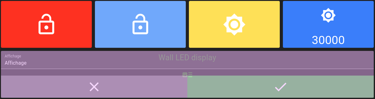
Example:
{
"valueSubscriptions": {
    "values": {
        "id": "root.office.door.control.lock",
        "right": 2,
        "type": "BOOLEAN"
    }
}
"basicWidgetSettings": {
    "showLabel": false,
    "showValue": false,
    "icon": "meeting_room",
    "onIcon": "lock",
    "offIcon": "lock_open",
    "offBackgroundColor": "#ff3200",
    "offForegroundColor": "#fff",
    "onBackgroundColor": "#61c05e",
    "onForegroundColor": "#fff"
}
Which results in the following widget:


Integer/decimal widget
The following parameters can be used for integer/decimal value type:
Setting |
Usage |
Type |
Default value |
minvalue |
Defines the minimal value allowed |
number |
|
maxvalue |
Defines the maximal value allowed |
number |
|
unknownValue |
Used to set the integer/decimal value when value is |
number |
|
onValueText |
Text displayed when the value is equal or above |
string |
|
offValueText |
Text displayed when the value is equal or below |
string |
|
onIcon |
Icon displayed when the value is equal or above |
string |
|
offIcon |
Icon displayed when the value is equal or below |
string |
|
addIcon |
Icon displayed when the value is equal or above |
string |
|
removeIcon |
Icon displayed when the value is equal or below |
string |
|
onForegroundColor |
Widget foreground color (text, icon) when the value is equal or above |
string |
|
offForegroundColor |
Widget foreground color (text, icon) when the value is equal or below |
string |
|
onBackgroundColor |
Widget background color when the value is equal or above |
string |
|
offBackgroundColor |
Widget background color when the value is equal or below |
string |
|
valueStep |
Increment/decrement value when adding/removing |
number |
1 |
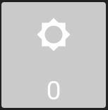
Example:
{
"valueSubscriptions": {
    "values": {
        "id": "root.office.logo.control.intensity",
        "right": 2,
        "type": "INTEGER"
    }
}
"basicWidgetSettings": {
    "showLabel": false,
    "icon": "brightness_4",
    "onIcon": "brightness_7",
    "offIcon": "brightness_low",
    "minValue": 0,
    "maxValue": 30000,
    "valueStep": 1000,
    "backgroundColor": "#63e1e4",
    "offBackgroundColor": "#cacaca",
    "offForegroundColor": "#fff",
    "onBackgroundColor": "#347cff",
    "onForegroundColor": "#fff"
   }
}
Which results in the following widget:


Text widget
The following parameters can be used for text value type:
Setting |
Usage |
Type |
Default value |
onValue |
Determines what constitutes a |
string |
|
offValue |
Determines what constitutes a |
||
onForegroundColor |
The foreground color (text, icon) of the widget when value is equal to |
string |
|
offForegroundColor |
The foreground color (text, icon) of the widget when value is equal to |
string |
|
onBackgroundColor |
The background color of the widget when value is equal to |
string |
|
offBackgroundColor |
The background color of the widget when value is equal to |
string |
|
onIcon |
Displays the icon when the value is equal to |
string |
|
offIcon |
Displays the icon when the value is equal to |
string |
|
textInputLabel |
The text field label when updating text value |
string |
|
textAcceptIcon |
The icon displayed as button to accept text change |
string |
|
textAcceptForeground |
The accept icon foreground color |
string |
|
textAcceptBackground |
The accept button background color |
string |
|
textCancelIcon |
The icon displayed as button to cancel text change |
string |
|
textCancelForeground |
The cancel icon foreground color |
string |
|
textCancelBackground |
The cancel button background color |
string |
Example:
{
"valueSubscriptions": {
    "values": {
        "id": "root.office.door.state.mode",
        "right": 0,
        "type": "TEXT"
    }
},
"basicWidgetSettings": {
    "showLabel": false,
    "showValue": false,
    "icon": "meeting_room",
    "onIcon": "lock",
    "onValue": "LOCKED",
    "offValue": "UNLOCKED",
    "offIcon": "lock_open",
    "offBackgroundColor": "#6da7ff",
    "offForegroundColor": "#fff",
    "onBackgroundColor": "#ffc800",
    "onForegroundColor": "#fff",
    "textInputLabel": "Porte",
    "textAcceptIcon": "done",
    "textAcceptBackground": "#61c05e",
    "textAcceptForeground": "#ffffff",
    "textCancelIcon": "close",
    "textCancelBackground": "#858585",
    "textCancelForeground": "#ffffff"
}
Which results in the following widget:


Icons
All icon parameters can be filled with value from Material-UI listing.
Values provided by Material-UI listing in CamelCase must be converted into snake_case for OnSphere:
LockOpen becomes lock_open
ViewList becomes view_list
Widget context
It is possible to access dynamic evaluation using onClick. In addition to shared context, available content is:
osp.widgets(id): to access any widget available in current dashboard using widgetid. This will allow access to widget exposed features.osp.navigate(path)to navigate to any dashboard (path format:root.dashboard.path) (previouslyosp.navigateTo, still supported)osp.evaluate(code): to allow menucodeinteraction evaluation (see dynamic evaluation)
Format specification
Extracted from the sprintf.js README
The placeholders in the format string are marked by % and are followed by one or more of these elements, in this order:
An optional number followed by a
$sign that selects which argument index to use for the value. If not specified, arguments will be placed in the same order as the placeholders in the input string.An optional
+sign that forces to precede the result with a plus or minus sign on numeric values. By default, only the-sign is used on negative numbers.An optional padding specifier that says what character to use for padding (if specified). Possible values are
0or any other character preceded by a'(single quote). The default is to pad with spaces.An optional
-sign, that causessprintfto left-align the result of this placeholder. The default is to right-align the result.An optional number, that says how many characters the result should have. If the value to be returned is shorter than this number, the result will be padded. When used with the
j(JSON) type specifier, the padding length specifies the tab size used for indentation.An optional precision modifier, consisting of a
.(dot) followed by a number, that says how many digits should be displayed for floating point numbers. When used with thegtype specifier, it specifies the number of significant digits. When used on a string, it causes the result to be truncated.- A type specifier that can be any of:
%— yields a literal%characterb— yields an integer as a binary numberc— yields an integer as the character with that ASCII valuedori— yields an integer as a signed decimal numbere— yields a float using scientific notationu— yields an integer as an unsigned decimal numberf— yields a float as is; see notes on precision aboveg— yields a float as is; see notes on precision aboveo— yields an integer as an octal numbers— yields a string as ist— yieldstrueorfalseT— yields the type of the argumentv— yields the primitive value of the specified argumentx— yields an integer as a hexadecimal number (lower-case)X— yields an integer as a hexadecimal number (upper-case)j— yields a JavaScript object or array as a JSON encoded string